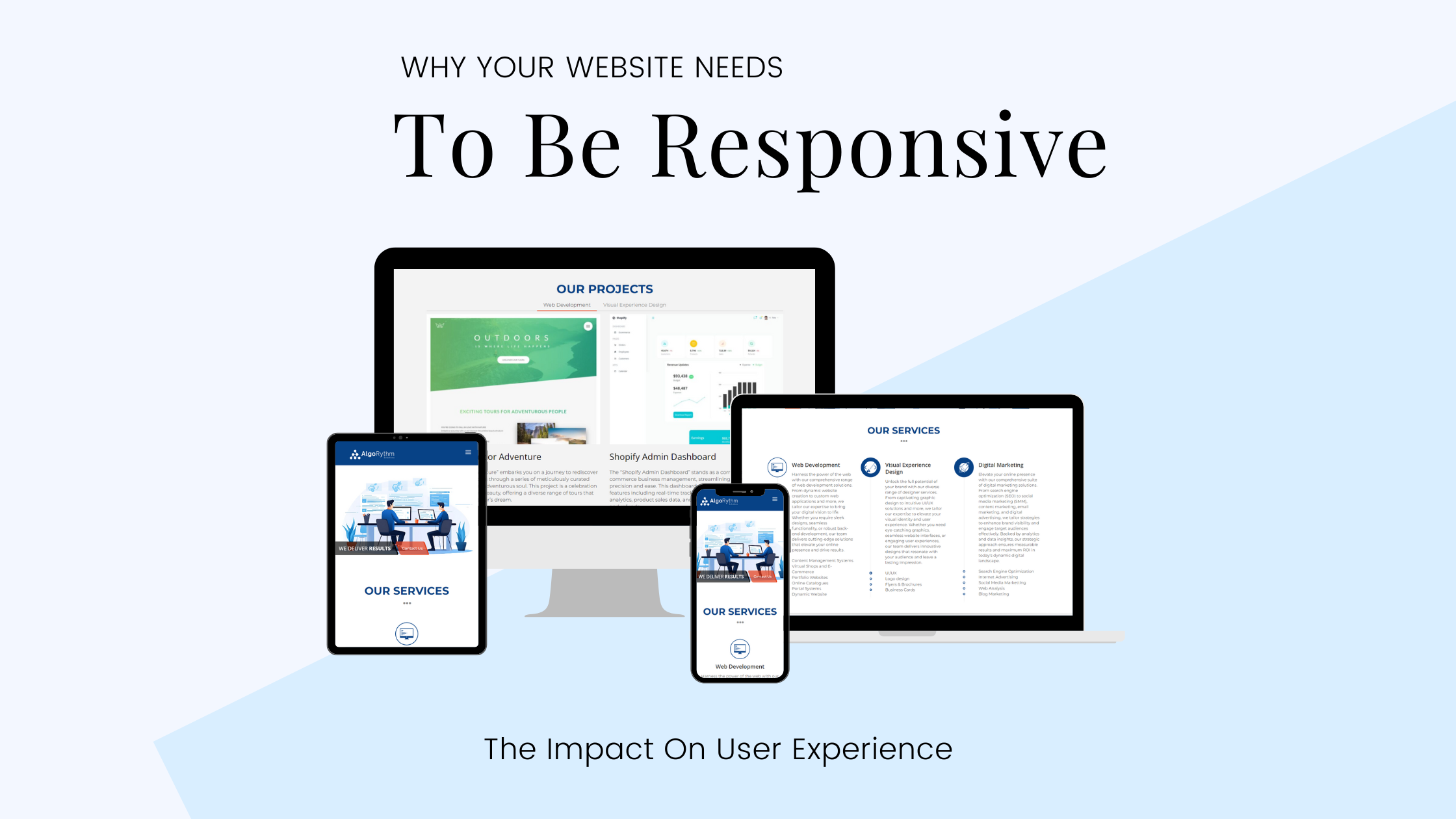
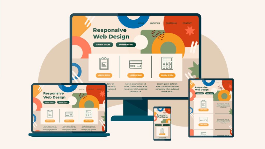
Responsive web design (RWD) is crucial for ensuring seamless user experience across different devices and resolutions. It involves adapting site layout to varied devices such as desktops, laptops, tablets, and smartphones. In this multi-device world, having a responsive website is essential to cater to the diverse preferences of users.
Responsive web design is a critical approach to web design that ensures web pages render well on a variety of devices and window or screen sizes. This includes various devices such as desktops, laptops, tablets, and smartphones. RWD involves adapting the layout of the website to the viewing environment by using fluid, proportion-based grids, flexible images, and CSS3 media queries.
What Is Responsive Web Design (RWD) And How Does It Work?
Responsive web design is an approach to web design that makes web pages render well on a variety of devices and window or screen sizes. This is achieved by using flexible grid layouts, images, and CSS media queries.
Overview Of The Key Principles Of RWD
The key principles of RWD include:
- Flexible grids and layouts
- Images
- CSS media queries
It ensures that the website layout adapts to the viewing environment by using fluid grids and flexible images.
How RWD Helps Websites Adapt To Different Devices And Resolutions
RWD helps websites adapt to different devices and resolutions by creating a flexible and optimized layout that can adjust to various screen sizes and orientations. This ensures that users have a seamless experience regardless of the device they are using.
The Key Benefits Of Having A Responsive Website
Having a responsive website offers numerous benefits that can greatly enhance the overall user experience. Let’s explore some of the key advantages:
1. Increased Mobile Traffic And Improved SEO Performance
With the proliferation of mobile devices, a significant portion of web traffic now comes from smartphones and tablets. By having a responsive website, you ensure that your content is easily accessible to mobile users. This not only improves user experience but also has a positive impact on your website’s search engine optimization (SEO) performance.
Search engines like Google prioritize mobile-friendly websites in their search results, which can lead to higher visibility and increased organic traffic. It’s important to note that this extends beyond just having a responsive website, as optimizing specific platforms such as WordPress for mobile usage can further enhance these benefits, as outlined in this WordPress mobile optimization guide.
2. Enhanced User Experience Leading To Higher Conversions
A well-designed responsive website provides a seamless and consistent browsing experience across different devices and screen sizes. Users can access your site on their preferred device without any usability issues or frustrations.
This improved user experience translates into higher engagement, longer time spent on your site, and ultimately, a higher conversion rate. Whether it’s making a purchase, filling out a form, or subscribing to a newsletter, a responsive website makes it easier for users to take action.
3. Maintaining Consistency Across Different Browsers And Devices
One of the challenges of traditional non-responsive websites is maintaining consistency across different browsers and devices. With a responsive design, you can ensure that your website looks and functions consistently regardless of whether it’s accessed on a desktop, laptop, tablet, or smartphone.
This eliminates the need for separate mobile versions or multiple websites for different devices, simplifying maintenance and reducing development costs.
By embracing responsive web design principles and implementing them effectively, you can unlock these benefits and provide an optimal user experience for your audience.
Best Practices For Implementing Responsive Design
Implementing responsive design is crucial to ensure that your website provides a seamless user experience across different devices and screen resolutions. Here are some best practices to consider:
Utilizing CSS Media Queries To Enforce Responsive Styles At Different Breakpoints
CSS media queries allow you to define different styles based on the width, height, orientation, and resolution of the device. By using media queries, you can create a responsive design that adapts to various devices and resolutions. Here are a few tips for utilizing CSS media queries effectively:
- Define breakpoints: Identify specific points where your website layout needs to change based on the device’s screen size. This could include breakpoints for small screens, tablets, and desktops.
- Use relative units: Instead of using fixed pixel values for widths and heights, use relative units like percentages or ems. This ensures that your layout adjusts proportionally when the screen size changes.
- Prioritize content: Consider which elements are essential for different screen sizes and prioritize them accordingly. Hide or reposition less important elements on smaller screens to optimize space.
Creating Flexible Layouts With Fluid Grid Systems
Fluid grid systems allow you to create flexible layouts that automatically adjust their elements based on the page size changes. This ensures that your website looks consistent and visually appealing across various screen resolutions. Here’s how you can create flexible layouts:
- Use percentage-based widths: Instead of setting fixed pixel widths for your page elements, use percentages. This allows the elements to adjust their sizes proportionally as the screen size changes.
- Set max-widths: To prevent elements from becoming too stretched out on larger screens, set max-widths for certain containers or sections of your website.
- Test across devices: It’s essential to test your responsive design on different devices and screen resolutions to ensure that it functions as intended. Use real user conditions on a cloud platform to simulate various device environments.
By following these best practices, you can effectively implement responsive design and provide an optimal user experience across different devices and screen resolutions.
Considering Screen Resolutions In Your Responsive Design Strategy
When it comes to responsive web design, it’s essential to consider the impact of common screen resolutions on your design decisions. Understanding the prevalent screen resolutions for both mobile devices and desktops is crucial for creating a seamless user experience across different platforms.

1. Mobile Devices
Common screen resolutions for mobile devices include:
- 360×800
- 390×844
- 414×896
These dimensions represent the varying display sizes of smartphones and tablets. Designing your website to adapt effectively to these resolutions ensures that users have an optimal viewing experience on their mobile devices.
2. Desktop Screen Resolutions
For desktop computers, common screen resolutions encompass:
- 1920×1080
- 1366×768
- 1440×900
These dimensions reflect the diverse monitor sizes and display capabilities of desktop users. Adapting your website layout to accommodate these resolutions is vital for delivering a consistent and visually appealing interface on desktop screens. By acknowledging and addressing these common screen resolutions in your responsive design strategy, you can tailor your website’s layout and content to suit the specific display characteristics of various devices. This approach enhances user satisfaction and ensures that visitors have a positive interaction with your website regardless of the device they are using. If you want to dive deeper into responsive web design techniques, you can explore this informative introduction to responsive web design.
Media Queries
Media queries are an essential tool for creating responsive web designs that adapt to various devices and resolutions. With media queries, developers can apply different styles to a website based on the characteristics of the user’s device, such as screen width or resolution.
Why Are Media Queries Important?
- Websites can be optimized for different devices, ensuring a consistent and user-friendly experience across various platforms
- Particularly important in today’s multi-device world, where users access websites from desktops, laptops, tablets, and smartphones
How Do Media Queries Work?
Media queries allow you to set specific CSS rules based on the width, height, orientation, and resolution of the device. For example, you can define different styles for desktop screens, tablet screens, and smartphone screens. This flexibility enables the implementation of responsive design principles, where the layout and content of a website automatically adjust to fit the screen size and capabilities of the device being used.
Benefits Of Using Media Queries
- Create breakpoints at specific screen widths where the layout changes
- Define a breakpoint at 768 pixels to switch from a desktop layout to a tablet layout
- Ensure that your website looks great and functions properly on different devices
- Provide an optimal user experience across all devices
Conclusion
Having a responsive website is crucial in today’s multi-device world to provide a seamless user experience. The impact of responsiveness for websites on different devices and resolutions cannot be underestimated. By implementing responsive web design (RWD) principles and utilizing CSS media queries, you can ensure that your website adapts to various devices and screen sizes, resulting in enhanced user experience.
Here Are The Key Takeaways:
- Responsive web design (RWD) allows your website to adapt to different devices and resolutions.
- Media queries enable you to apply different styles based on device characteristics, such as screen width or resolution.
- A responsive website leads to increased mobile traffic, improved SEO performance, and higher conversion rates.
- Consistency across different browsers and devices is maintained with a responsive design.
- Best practices for implementing responsive design include using fluid grid systems and setting breakpoints for content alignment.
- Considering common screen resolutions is essential in designing responsive websites.
By prioritizing responsiveness for your website, you can create a highly engaging and accessible user experience across all devices. So make sure to implement these strategies and optimize your website for different devices and resolutions to delight your users.


Nice information!
Great Insights, please continue writing such Blogs
I appreciate you sharing this blog post. Thanks Again. Cool.
Awesome! Its genuinely remarkable post, I have got much clear idea regarding from this post
Great information shared.. really enjoyed reading this post thank you author for sharing this post .. appreciated
Great information shared.. really enjoyed reading this post thank you author for sharing this post .. appreciated